


Client: Starbucks JAPAN
For the 2011 Starbucks Japan Spring campaign, the creative concept explores the harmony of spring through the lens of stained glass art. The flurry of falling cherry blossoms is reinterpreted into rich, layered facets of colour, evoking deep tranquillity and joyful celebration.
To elevate the tactile experience, the artwork was meticulously printed on translucent PVC, with sakura branches accented by specialised metallic gold ink. This custom finish captures and diffuses light beautifully, mimicking the mesmerising depth of authentic stained glass and bringing exquisite artistic elegance to the local market.
2011 年日本星巴克春季企劃,創意核心聚焦於透過「工藝琉璃窗」的光影視角來重新詮釋春櫻。滿天飛舞的櫻花雪被解構為層次豐富、色澤交疊的幾何色塊,傳遞安寧而溫暖的喜悅情感。為了提升實體的觸覺與視覺層次,作品精細印刷於半透明 PVC 材質上,並在櫻花樹枝線條上揉入奢華的金屬金特殊油墨。
當光線穿透時,材質折射出如手工琉璃般的深邃光澤,為空間營造出細緻、華麗且極具藝術底蘊的優雅氛圍。

For the 2011 Starbucks Japan Spring campaign, the creative concept explores the harmony of spring through the lens of stained glass art. The flurry of falling cherry blossoms is reinterpreted into rich, layered facets of colour, evoking deep tranquillity and joyful celebration.
To elevate the tactile experience, the artwork was meticulously printed on translucent PVC, with sakura branches accented by specialised metallic gold ink. This custom finish captures and diffuses light beautifully, mimicking the mesmerising depth of authentic stained glass and bringing exquisite artistic elegance to the local market.

For the 2011 Starbucks Japan Spring campaign, the creative concept explores the harmony of spring through the lens of stained glass art. The flurry of falling cherry blossoms is reinterpreted into rich, layered facets of colour, evoking deep tranquillity and joyful celebration.
To elevate the tactile experience, the artwork was meticulously printed on translucent PVC, with sakura branches accented by specialised metallic gold ink. This custom finish captures and diffuses light beautifully, mimicking the mesmerising depth of authentic stained glass and bringing exquisite artistic elegance to the local market.
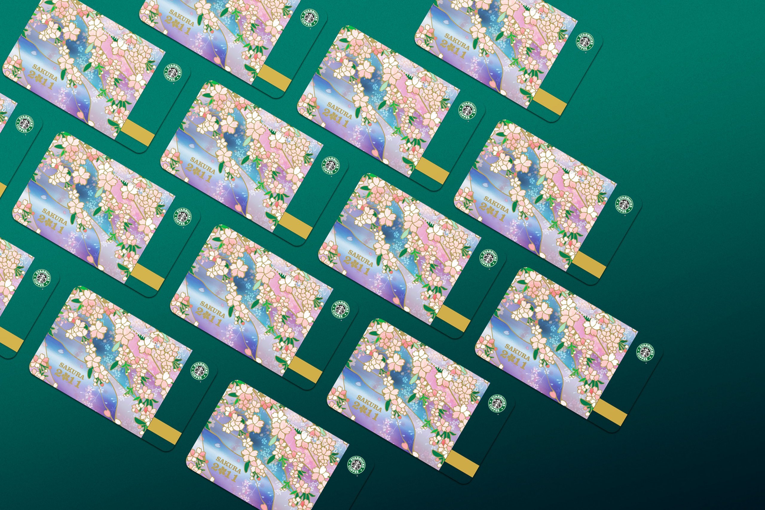


For the 2011 Starbucks Japan Spring campaign, the creative concept explores the harmony of spring through the lens of stained glass art. The flurry of falling cherry blossoms is reinterpreted into rich, layered facets of colour, evoking deep tranquillity and joyful celebration.
To elevate the tactile experience, the artwork was meticulously printed on translucent PVC, with sakura branches accented by specialised metallic gold ink. This custom finish captures and diffuses light beautifully, mimicking the mesmerising depth of authentic stained glass and bringing exquisite artistic elegance to the local market.

For the 2011 Starbucks Japan Spring campaign, the creative concept explores the harmony of spring through the lens of stained glass art. The flurry of falling cherry blossoms is reinterpreted into rich, layered facets of colour, evoking deep tranquillity and joyful celebration.
To elevate the tactile experience, the artwork was meticulously printed on translucent PVC, with sakura branches accented by specialised metallic gold ink. This custom finish captures and diffuses light beautifully, mimicking the mesmerising depth of authentic stained glass and bringing exquisite artistic elegance to the local market.

For the 2011 Starbucks Japan Spring campaign, the creative concept explores the harmony of spring through the lens of stained glass art. The flurry of falling cherry blossoms is reinterpreted into rich, layered facets of colour, evoking deep tranquillity and joyful celebration.
To elevate the tactile experience, the artwork was meticulously printed on translucent PVC, with sakura branches accented by specialised metallic gold ink. This custom finish captures and diffuses light beautifully, mimicking the mesmerising depth of authentic stained glass and bringing exquisite artistic elegance to the local market.

Client: Starbucks JAPAN
For the 2011 Starbucks Japan Spring campaign, the creative concept explores the harmony of spring through the lens of stained glass art. The flurry of falling cherry blossoms is reinterpreted into rich, layered facets of colour, evoking deep tranquillity and joyful celebration.
To elevate the tactile experience, the artwork was meticulously printed on translucent PVC, with sakura branches accented by specialised metallic gold ink. This custom finish captures and diffuses light beautifully, mimicking the mesmerising depth of authentic stained glass and bringing exquisite artistic elegance to the local market.
2011 年日本星巴克春季企劃,創意核心聚焦於透過「工藝琉璃窗」的光影視角來重新詮釋春櫻。滿天飛舞的櫻花雪被解構為層次豐富、色澤交疊的幾何色塊,傳遞安寧而溫暖的喜悅情感。為了提升實體的觸覺與視覺層次,作品精細印刷於半透明 PVC 材質上,並在櫻花樹枝線條上揉入奢華的金屬金特殊油墨。
當光線穿透時,材質折射出如手工琉璃般的深邃光澤,為空間營造出細緻、華麗且極具藝術底蘊的優雅氛圍。
For the 2011 Starbucks Japan Spring campaign, the creative concept explores the harmony of spring through the lens of stained glass art. The flurry of falling cherry blossoms is reinterpreted into rich, layered facets of colour, evoking deep tranquillity and joyful celebration.
To elevate the tactile experience, the artwork was meticulously printed on translucent PVC, with sakura branches accented by specialised metallic gold ink. This custom finish captures and diffuses light beautifully, mimicking the mesmerising depth of authentic stained glass and bringing exquisite artistic elegance to the local market.
For the 2011 Starbucks Japan Spring campaign, the creative concept explores the harmony of spring through the lens of stained glass art. The flurry of falling cherry blossoms is reinterpreted into rich, layered facets of colour, evoking deep tranquillity and joyful celebration.
To elevate the tactile experience, the artwork was meticulously printed on translucent PVC, with sakura branches accented by specialised metallic gold ink. This custom finish captures and diffuses light beautifully, mimicking the mesmerising depth of authentic stained glass and bringing exquisite artistic elegance to the local market.
For the 2011 Starbucks Japan Spring campaign, the creative concept explores the harmony of spring through the lens of stained glass art. The flurry of falling cherry blossoms is reinterpreted into rich, layered facets of colour, evoking deep tranquillity and joyful celebration.
To elevate the tactile experience, the artwork was meticulously printed on translucent PVC, with sakura branches accented by specialised metallic gold ink. This custom finish captures and diffuses light beautifully, mimicking the mesmerising depth of authentic stained glass and bringing exquisite artistic elegance to the local market.
For the 2011 Starbucks Japan Spring campaign, the creative concept explores the harmony of spring through the lens of stained glass art. The flurry of falling cherry blossoms is reinterpreted into rich, layered facets of colour, evoking deep tranquillity and joyful celebration.
To elevate the tactile experience, the artwork was meticulously printed on translucent PVC, with sakura branches accented by specialised metallic gold ink. This custom finish captures and diffuses light beautifully, mimicking the mesmerising depth of authentic stained glass and bringing exquisite artistic elegance to the local market.
For the 2011 Starbucks Japan Spring campaign, the creative concept explores the harmony of spring through the lens of stained glass art. The flurry of falling cherry blossoms is reinterpreted into rich, layered facets of colour, evoking deep tranquillity and joyful celebration.
To elevate the tactile experience, the artwork was meticulously printed on translucent PVC, with sakura branches accented by specialised metallic gold ink. This custom finish captures and diffuses light beautifully, mimicking the mesmerising depth of authentic stained glass and bringing exquisite artistic elegance to the local market.
For the 2011 Starbucks Japan Spring campaign, the creative concept explores the harmony of spring through the lens of stained glass art. The flurry of falling cherry blossoms is reinterpreted into rich, layered facets of colour, evoking deep tranquillity and joyful celebration.
To elevate the tactile experience, the artwork was meticulously printed on translucent PVC, with sakura branches accented by specialised metallic gold ink. This custom finish captures and diffuses light beautifully, mimicking the mesmerising depth of authentic stained glass and bringing exquisite artistic elegance to the local market.
For the 2011 Starbucks Japan Spring campaign, the creative concept explores the harmony of spring through the lens of stained glass art. The flurry of falling cherry blossoms is reinterpreted into rich, layered facets of colour, evoking deep tranquillity and joyful celebration.
To elevate the tactile experience, the artwork was meticulously printed on translucent PVC, with sakura branches accented by specialised metallic gold ink. This custom finish captures and diffuses light beautifully, mimicking the mesmerising depth of authentic stained glass and bringing exquisite artistic elegance to the local market.
Client: Starbucks JAPAN
For the 2011 Starbucks Japan Spring campaign, the creative concept explores the harmony of spring through the lens of stained glass art. The flurry of falling cherry blossoms is reinterpreted into rich, layered facets of colour, evoking deep tranquillity and joyful celebration.
To elevate the tactile experience, the artwork was meticulously printed on translucent PVC, with sakura branches accented by specialised metallic gold ink. This custom finish captures and diffuses light beautifully, mimicking the mesmerising depth of authentic stained glass and bringing exquisite artistic elegance to the local market.
2011 年日本星巴克春季企劃,創意核心聚焦於透過「工藝琉璃窗」的光影視角來重新詮釋春櫻。滿天飛舞的櫻花雪被解構為層次豐富、色澤交疊的幾何色塊,傳遞安寧而溫暖的喜悅情感。為了提升實體的觸覺與視覺層次,作品精細印刷於半透明 PVC 材質上,並在櫻花樹枝線條上揉入奢華的金屬金特殊油墨。
當光線穿透時,材質折射出如手工琉璃般的深邃光澤,為空間營造出細緻、華麗且極具藝術底蘊的優雅氛圍。
For the 2011 Starbucks Japan Spring campaign, the creative concept explores the harmony of spring through the lens of stained glass art. The flurry of falling cherry blossoms is reinterpreted into rich, layered facets of colour, evoking deep tranquillity and joyful celebration.
To elevate the tactile experience, the artwork was meticulously printed on translucent PVC, with sakura branches accented by specialised metallic gold ink. This custom finish captures and diffuses light beautifully, mimicking the mesmerising depth of authentic stained glass and bringing exquisite artistic elegance to the local market.
For the 2011 Starbucks Japan Spring campaign, the creative concept explores the harmony of spring through the lens of stained glass art. The flurry of falling cherry blossoms is reinterpreted into rich, layered facets of colour, evoking deep tranquillity and joyful celebration.
To elevate the tactile experience, the artwork was meticulously printed on translucent PVC, with sakura branches accented by specialised metallic gold ink. This custom finish captures and diffuses light beautifully, mimicking the mesmerising depth of authentic stained glass and bringing exquisite artistic elegance to the local market.
For the 2011 Starbucks Japan Spring campaign, the creative concept explores the harmony of spring through the lens of stained glass art. The flurry of falling cherry blossoms is reinterpreted into rich, layered facets of colour, evoking deep tranquillity and joyful celebration.
To elevate the tactile experience, the artwork was meticulously printed on translucent PVC, with sakura branches accented by specialised metallic gold ink. This custom finish captures and diffuses light beautifully, mimicking the mesmerising depth of authentic stained glass and bringing exquisite artistic elegance to the local market.
For the 2011 Starbucks Japan Spring campaign, the creative concept explores the harmony of spring through the lens of stained glass art. The flurry of falling cherry blossoms is reinterpreted into rich, layered facets of colour, evoking deep tranquillity and joyful celebration.
To elevate the tactile experience, the artwork was meticulously printed on translucent PVC, with sakura branches accented by specialised metallic gold ink. This custom finish captures and diffuses light beautifully, mimicking the mesmerising depth of authentic stained glass and bringing exquisite artistic elegance to the local market.
For the 2011 Starbucks Japan Spring campaign, the creative concept explores the harmony of spring through the lens of stained glass art. The flurry of falling cherry blossoms is reinterpreted into rich, layered facets of colour, evoking deep tranquillity and joyful celebration.
To elevate the tactile experience, the artwork was meticulously printed on translucent PVC, with sakura branches accented by specialised metallic gold ink. This custom finish captures and diffuses light beautifully, mimicking the mesmerising depth of authentic stained glass and bringing exquisite artistic elegance to the local market.
For the 2011 Starbucks Japan Spring campaign, the creative concept explores the harmony of spring through the lens of stained glass art. The flurry of falling cherry blossoms is reinterpreted into rich, layered facets of colour, evoking deep tranquillity and joyful celebration.
To elevate the tactile experience, the artwork was meticulously printed on translucent PVC, with sakura branches accented by specialised metallic gold ink. This custom finish captures and diffuses light beautifully, mimicking the mesmerising depth of authentic stained glass and bringing exquisite artistic elegance to the local market.
For the 2011 Starbucks Japan Spring campaign, the creative concept explores the harmony of spring through the lens of stained glass art. The flurry of falling cherry blossoms is reinterpreted into rich, layered facets of colour, evoking deep tranquillity and joyful celebration.
To elevate the tactile experience, the artwork was meticulously printed on translucent PVC, with sakura branches accented by specialised metallic gold ink. This custom finish captures and diffuses light beautifully, mimicking the mesmerising depth of authentic stained glass and bringing exquisite artistic elegance to the local market.
For the 2011 Starbucks Japan Spring campaign, the creative concept explores the harmony of spring through the lens of stained glass art. The flurry of falling cherry blossoms is reinterpreted into rich, layered facets of colour, evoking deep tranquillity and joyful celebration.
To elevate the tactile experience, the artwork was meticulously printed on translucent PVC, with sakura branches accented by specialised metallic gold ink. This custom finish captures and diffuses light beautifully, mimicking the mesmerising depth of authentic stained glass and bringing exquisite artistic elegance to the local market.
Client: Starbucks JAPAN
For the 2011 Starbucks Japan Spring campaign, the creative concept explores the harmony of spring through the lens of stained glass art. The flurry of falling cherry blossoms is reinterpreted into rich, layered facets of colour, evoking deep tranquillity and joyful celebration.
To elevate the tactile experience, the artwork was meticulously printed on translucent PVC, with sakura branches accented by specialised metallic gold ink. This custom finish captures and diffuses light beautifully, mimicking the mesmerising depth of authentic stained glass and bringing exquisite artistic elegance to the local market.
啟動大會是迪士尼位於中國地區的年度盛事。活動主旨:發表迪士尼商業機密宏圖,邀請各領域的合作夥伴如製造商、銷售商和供應商來共襄盛舉。我們首要任務是執行策劃一個嶄新的活動場地,讓所有貴賓都沉浸體驗於迪士尼世界之中。
2011 年日本星巴克春季企劃,創意核心聚焦於透過「工藝琉璃窗」的光影視角來重新詮釋春櫻。滿天飛舞的櫻花雪被解構為層次豐富、色澤交疊的幾何色塊,傳遞安寧而溫暖的喜悅情感。為了提升實體的觸覺與視覺層次,作品精細印刷於半透明 PVC 材質上,並在櫻花樹枝線條上揉入奢華的金屬金特殊油墨。
當光線穿透時,材質折射出如手工琉璃般的深邃光澤,為空間營造出細緻、華麗且極具藝術底蘊的優雅氛圍。
該場館旨在融合迪士尼、皮克斯、星際大戰和漫威等品牌,打造出卓越的活動體驗。視覺效果色彩採用內部提供的品牌主色調,結合其品牌代表的 IP 執行主視覺設計內容。運用各LOGO標誌結合轉變成圖騰配置搭襯。此外,與過往不同的是,此次是透過三個主要 LED 數位產品牆進行了全新產品的展示方式,含概產品約莫 1500 種以上,向所有供應商/貴賓展示了全新的沉浸式的體驗。

For the 2011 Starbucks Japan Spring campaign, the creative concept explores the harmony of spring through the lens of stained glass art. The flurry of falling cherry blossoms is reinterpreted into rich, layered facets of colour, evoking deep tranquillity and joyful celebration.
To elevate the tactile experience, the artwork was meticulously printed on translucent PVC, with sakura branches accented by specialised metallic gold ink. This custom finish captures and diffuses light beautifully, mimicking the mesmerising depth of authentic stained glass and bringing exquisite artistic elegance to the local market.
For the 2011 Starbucks Japan Spring campaign, the creative concept explores the harmony of spring through the lens of stained glass art. The flurry of falling cherry blossoms is reinterpreted into rich, layered facets of colour, evoking deep tranquillity and joyful celebration.
To elevate the tactile experience, the artwork was meticulously printed on translucent PVC, with sakura branches accented by specialised metallic gold ink. This custom finish captures and diffuses light beautifully, mimicking the mesmerising depth of authentic stained glass and bringing exquisite artistic elegance to the local market.
For the 2011 Starbucks Japan Spring campaign, the creative concept explores the harmony of spring through the lens of stained glass art. The flurry of falling cherry blossoms is reinterpreted into rich, layered facets of colour, evoking deep tranquillity and joyful celebration.
To elevate the tactile experience, the artwork was meticulously printed on translucent PVC, with sakura branches accented by specialised metallic gold ink. This custom finish captures and diffuses light beautifully, mimicking the mesmerising depth of authentic stained glass and bringing exquisite artistic elegance to the local market.


The critical challenge is to manage tons of products for four different types of notable brands on one big screen. The solution to these challenges is through UI/UX design to deliver interfaces that make technology more natural and enjoyable, bringing cohesion to each brand architecture and product type and establishing a straightforward brand narrative and tone.
The screen navigates attention through interactive motion. It also turns the entire space into a brilliant piece of public art by responding to how the user behaves and responding interactively using the whole screen. It allows audiences to experience fully realised areas where they can encounter large-scale works of art right where they are.
這次項目最具關鍵的挑戰於在大型數位牆上整合管理四種不同類型的品牌產品呈現。團隊透過UI/UX歷經數月的測試提出最佳的設計解決方案,創造出令人愉悅的介面,讓使用者體驗技術更加和諧,為每個品牌架構和產品類型帶來凝聚力,並建立更直覺的品牌敘述和基調。
數位牆可透過使用者互動形式方式即時回饋反應來引導注意力,當數位牆面呈現動態待機模式時,整體空間將轉變成一件絢麗的公共藝術品。讓來訪群眾可完全直觀沈浸欣賞的大型藝術作品。
For the 2011 Starbucks Japan Spring campaign, the creative concept explores the harmony of spring through the lens of stained glass art. The flurry of falling cherry blossoms is reinterpreted into rich, layered facets of colour, evoking deep tranquillity and joyful celebration.
To elevate the tactile experience, the artwork was meticulously printed on translucent PVC, with sakura branches accented by specialised metallic gold ink. This custom finish captures and diffuses light beautifully, mimicking the mesmerising depth of authentic stained glass and bringing exquisite artistic elegance to the local market.
For the 2011 Starbucks Japan Spring campaign, the creative concept explores the harmony of spring through the lens of stained glass art. The flurry of falling cherry blossoms is reinterpreted into rich, layered facets of colour, evoking deep tranquillity and joyful celebration.
To elevate the tactile experience, the artwork was meticulously printed on translucent PVC, with sakura branches accented by specialised metallic gold ink. This custom finish captures and diffuses light beautifully, mimicking the mesmerising depth of authentic stained glass and bringing exquisite artistic elegance to the local market.
For the 2011 Starbucks Japan Spring campaign, the creative concept explores the harmony of spring through the lens of stained glass art. The flurry of falling cherry blossoms is reinterpreted into rich, layered facets of colour, evoking deep tranquillity and joyful celebration.
To elevate the tactile experience, the artwork was meticulously printed on translucent PVC, with sakura branches accented by specialised metallic gold ink. This custom finish captures and diffuses light beautifully, mimicking the mesmerising depth of authentic stained glass and bringing exquisite artistic elegance to the local market.
For the 2011 Starbucks Japan Spring campaign, the creative concept explores the harmony of spring through the lens of stained glass art. The flurry of falling cherry blossoms is reinterpreted into rich, layered facets of colour, evoking deep tranquillity and joyful celebration.
To elevate the tactile experience, the artwork was meticulously printed on translucent PVC, with sakura branches accented by specialised metallic gold ink. This custom finish captures and diffuses light beautifully, mimicking the mesmerising depth of authentic stained glass and bringing exquisite artistic elegance to the local market.
A liberated digital products wall without restrictions, making numerous products browse accessible in arena corridor to the audience of thousands. That allows users to intuitively and closely view the works that catch their eye from among large quantities of images.
Users can use diverse operating methods to choose their favourite products on the large screen, including product enlargement, stylebooks, video playing, or a 360-degree view to see detailed information.
The solution, without any restrictions regarding location, allowed Disney to convey unlimited creativity put into it. For the first time, the suppliers/guests can directly discover their parent products that were rarely available for display.
不受限制的產品數位牆,使場地廊道來訪的數千名來賓同時可一次瀏覽眾多產品。透過使用者互動方式從大量圖像中直觀、近距離地選取查看想閱覽的產品。
使用者可以透過多種操作功能方式在大螢幕上選擇自己喜歡的商品,包括產品放大、樣本、影片播放或360度產品視角查看等詳細資訊。
該解決方案不受地點限制,使迪士尼能夠表達其中投入的無限創造力。讓來嘉賓可發現過往少於被展示的自身產品。
For the 2011 Starbucks Japan Spring campaign, the creative concept explores the harmony of spring through the lens of stained glass art. The flurry of falling cherry blossoms is reinterpreted into rich, layered facets of colour, evoking deep tranquillity and joyful celebration.
To elevate the tactile experience, the artwork was meticulously printed on translucent PVC, with sakura branches accented by specialised metallic gold ink. This custom finish captures and diffuses light beautifully, mimicking the mesmerising depth of authentic stained glass and bringing exquisite artistic elegance to the local market.
Client: Starbucks JAPAN
For the 2011 Starbucks Japan Spring campaign, the creative concept explores the harmony of spring through the lens of stained glass art. The flurry of falling cherry blossoms is reinterpreted into rich, layered facets of colour, evoking deep tranquillity and joyful celebration.
To elevate the tactile experience, the artwork was meticulously printed on translucent PVC, with sakura branches accented by specialised metallic gold ink. This custom finish captures and diffuses light beautifully, mimicking the mesmerising depth of authentic stained glass and bringing exquisite artistic elegance to the local market.
2011 年日本星巴克春季企劃,創意核心聚焦於透過「工藝琉璃窗」的光影視角來重新詮釋春櫻。滿天飛舞的櫻花雪被解構為層次豐富、色澤交疊的幾何色塊,傳遞安寧而溫暖的喜悅情感。為了提升實體的觸覺與視覺層次,作品精細印刷於半透明 PVC 材質上,並在櫻花樹枝線條上揉入奢華的金屬金特殊油墨。
當光線穿透時,材質折射出如手工琉璃般的深邃光澤,為空間營造出細緻、華麗且極具藝術底蘊的優雅氛圍。
For the 2011 Starbucks Japan Spring campaign, the creative concept explores the harmony of spring through the lens of stained glass art. The flurry of falling cherry blossoms is reinterpreted into rich, layered facets of colour, evoking deep tranquillity and joyful celebration.
To elevate the tactile experience, the artwork was meticulously printed on translucent PVC, with sakura branches accented by specialised metallic gold ink. This custom finish captures and diffuses light beautifully, mimicking the mesmerising depth of authentic stained glass and bringing exquisite artistic elegance to the local market.
For the 2011 Starbucks Japan Spring campaign, the creative concept explores the harmony of spring through the lens of stained glass art. The flurry of falling cherry blossoms is reinterpreted into rich, layered facets of colour, evoking deep tranquillity and joyful celebration.
To elevate the tactile experience, the artwork was meticulously printed on translucent PVC, with sakura branches accented by specialised metallic gold ink. This custom finish captures and diffuses light beautifully, mimicking the mesmerising depth of authentic stained glass and bringing exquisite artistic elegance to the local market.
For the 2011 Starbucks Japan Spring campaign, the creative concept explores the harmony of spring through the lens of stained glass art. The flurry of falling cherry blossoms is reinterpreted into rich, layered facets of colour, evoking deep tranquillity and joyful celebration.
To elevate the tactile experience, the artwork was meticulously printed on translucent PVC, with sakura branches accented by specialised metallic gold ink. This custom finish captures and diffuses light beautifully, mimicking the mesmerising depth of authentic stained glass and bringing exquisite artistic elegance to the local market.
For the 2011 Starbucks Japan Spring campaign, the creative concept explores the harmony of spring through the lens of stained glass art. The flurry of falling cherry blossoms is reinterpreted into rich, layered facets of colour, evoking deep tranquillity and joyful celebration.
To elevate the tactile experience, the artwork was meticulously printed on translucent PVC, with sakura branches accented by specialised metallic gold ink. This custom finish captures and diffuses light beautifully, mimicking the mesmerising depth of authentic stained glass and bringing exquisite artistic elegance to the local market.
For the 2011 Starbucks Japan Spring campaign, the creative concept explores the harmony of spring through the lens of stained glass art. The flurry of falling cherry blossoms is reinterpreted into rich, layered facets of colour, evoking deep tranquillity and joyful celebration.
To elevate the tactile experience, the artwork was meticulously printed on translucent PVC, with sakura branches accented by specialised metallic gold ink. This custom finish captures and diffuses light beautifully, mimicking the mesmerising depth of authentic stained glass and bringing exquisite artistic elegance to the local market.
For the 2011 Starbucks Japan Spring campaign, the creative concept explores the harmony of spring through the lens of stained glass art. The flurry of falling cherry blossoms is reinterpreted into rich, layered facets of colour, evoking deep tranquillity and joyful celebration.
To elevate the tactile experience, the artwork was meticulously printed on translucent PVC, with sakura branches accented by specialised metallic gold ink. This custom finish captures and diffuses light beautifully, mimicking the mesmerising depth of authentic stained glass and bringing exquisite artistic elegance to the local market.
Client: Starbucks JAPAN
For the 2011 Starbucks Japan Spring campaign, the creative concept explores the harmony of spring through the lens of stained glass art. The flurry of falling cherry blossoms is reinterpreted into rich, layered facets of colour, evoking deep tranquillity and joyful celebration.
To elevate the tactile experience, the artwork was meticulously printed on translucent PVC, with sakura branches accented by specialised metallic gold ink. This custom finish captures and diffuses light beautifully, mimicking the mesmerising depth of authentic stained glass and bringing exquisite artistic elegance to the local market.

2011 年日本星巴克春季企劃,創意核心聚焦於透過「工藝琉璃窗」的光影視角來重新詮釋春櫻。滿天飛舞的櫻花雪被解構為層次豐富、色澤交疊的幾何色塊,傳遞安寧而溫暖的喜悅情感。為了提升實體的觸覺與視覺層次,作品精細印刷於半透明 PVC 材質上,並在櫻花樹枝線條上揉入奢華的金屬金特殊油墨。
當光線穿透時,材質折射出如手工琉璃般的深邃光澤,為空間營造出細緻、華麗且極具藝術底蘊的優雅氛圍。
For the 2011 Starbucks Japan Spring campaign, the creative concept explores the harmony of spring through the lens of stained glass art. The flurry of falling cherry blossoms is reinterpreted into rich, layered facets of colour, evoking deep tranquillity and joyful celebration.
To elevate the tactile experience, the artwork was meticulously printed on translucent PVC, with sakura branches accented by specialised metallic gold ink. This custom finish captures and diffuses light beautifully, mimicking the mesmerising depth of authentic stained glass and bringing exquisite artistic elegance to the local market.
For the 2011 Starbucks Japan Spring campaign, the creative concept explores the harmony of spring through the lens of stained glass art. The flurry of falling cherry blossoms is reinterpreted into rich, layered facets of colour, evoking deep tranquillity and joyful celebration.
To elevate the tactile experience, the artwork was meticulously printed on translucent PVC, with sakura branches accented by specialised metallic gold ink. This custom finish captures and diffuses light beautifully, mimicking the mesmerising depth of authentic stained glass and bringing exquisite artistic elegance to the local market.
For the 2011 Starbucks Japan Spring campaign, the creative concept explores the harmony of spring through the lens of stained glass art. The flurry of falling cherry blossoms is reinterpreted into rich, layered facets of colour, evoking deep tranquillity and joyful celebration.
To elevate the tactile experience, the artwork was meticulously printed on translucent PVC, with sakura branches accented by specialised metallic gold ink. This custom finish captures and diffuses light beautifully, mimicking the mesmerising depth of authentic stained glass and bringing exquisite artistic elegance to the local market.
For the 2011 Starbucks Japan Spring campaign, the creative concept explores the harmony of spring through the lens of stained glass art. The flurry of falling cherry blossoms is reinterpreted into rich, layered facets of colour, evoking deep tranquillity and joyful celebration.
To elevate the tactile experience, the artwork was meticulously printed on translucent PVC, with sakura branches accented by specialised metallic gold ink. This custom finish captures and diffuses light beautifully, mimicking the mesmerising depth of authentic stained glass and bringing exquisite artistic elegance to the local market.
For the 2011 Starbucks Japan Spring campaign, the creative concept explores the harmony of spring through the lens of stained glass art. The flurry of falling cherry blossoms is reinterpreted into rich, layered facets of colour, evoking deep tranquillity and joyful celebration.
To elevate the tactile experience, the artwork was meticulously printed on translucent PVC, with sakura branches accented by specialised metallic gold ink. This custom finish captures and diffuses light beautifully, mimicking the mesmerising depth of authentic stained glass and bringing exquisite artistic elegance to the local market.
For the 2011 Starbucks Japan Spring campaign, the creative concept explores the harmony of spring through the lens of stained glass art. The flurry of falling cherry blossoms is reinterpreted into rich, layered facets of colour, evoking deep tranquillity and joyful celebration.
To elevate the tactile experience, the artwork was meticulously printed on translucent PVC, with sakura branches accented by specialised metallic gold ink. This custom finish captures and diffuses light beautifully, mimicking the mesmerising depth of authentic stained glass and bringing exquisite artistic elegance to the local market.
For the 2011 Starbucks Japan Spring campaign, the creative concept explores the harmony of spring through the lens of stained glass art. The flurry of falling cherry blossoms is reinterpreted into rich, layered facets of colour, evoking deep tranquillity and joyful celebration.
To elevate the tactile experience, the artwork was meticulously printed on translucent PVC, with sakura branches accented by specialised metallic gold ink. This custom finish captures and diffuses light beautifully, mimicking the mesmerising depth of authentic stained glass and bringing exquisite artistic elegance to the local market.
Client: Starbucks JAPAN
For the 2011 Starbucks Japan Spring campaign, the creative concept explores the harmony of spring through the lens of stained glass art. The flurry of falling cherry blossoms is reinterpreted into rich, layered facets of colour, evoking deep tranquillity and joyful celebration.
To elevate the tactile experience, the artwork was meticulously printed on translucent PVC, with sakura branches accented by specialised metallic gold ink. This custom finish captures and diffuses light beautifully, mimicking the mesmerising depth of authentic stained glass and bringing exquisite artistic elegance to the local market.
2011 年日本星巴克春季企劃,創意核心聚焦於透過「工藝琉璃窗」的光影視角來重新詮釋春櫻。滿天飛舞的櫻花雪被解構為層次豐富、色澤交疊的幾何色塊,傳遞安寧而溫暖的喜悅情感。為了提升實體的觸覺與視覺層次,作品精細印刷於半透明 PVC 材質上,並在櫻花樹枝線條上揉入奢華的金屬金特殊油墨。
當光線穿透時,材質折射出如手工琉璃般的深邃光澤,為空間營造出細緻、華麗且極具藝術底蘊的優雅氛圍。
For the 2011 Starbucks Japan Spring campaign, the creative concept explores the harmony of spring through the lens of stained glass art. The flurry of falling cherry blossoms is reinterpreted into rich, layered facets of colour, evoking deep tranquillity and joyful celebration.
To elevate the tactile experience, the artwork was meticulously printed on translucent PVC, with sakura branches accented by specialised metallic gold ink. This custom finish captures and diffuses light beautifully, mimicking the mesmerising depth of authentic stained glass and bringing exquisite artistic elegance to the local market.
For the 2011 Starbucks Japan Spring campaign, the creative concept explores the harmony of spring through the lens of stained glass art. The flurry of falling cherry blossoms is reinterpreted into rich, layered facets of colour, evoking deep tranquillity and joyful celebration.
To elevate the tactile experience, the artwork was meticulously printed on translucent PVC, with sakura branches accented by specialised metallic gold ink. This custom finish captures and diffuses light beautifully, mimicking the mesmerising depth of authentic stained glass and bringing exquisite artistic elegance to the local market.
For the 2011 Starbucks Japan Spring campaign, the creative concept explores the harmony of spring through the lens of stained glass art. The flurry of falling cherry blossoms is reinterpreted into rich, layered facets of colour, evoking deep tranquillity and joyful celebration.
To elevate the tactile experience, the artwork was meticulously printed on translucent PVC, with sakura branches accented by specialised metallic gold ink. This custom finish captures and diffuses light beautifully, mimicking the mesmerising depth of authentic stained glass and bringing exquisite artistic elegance to the local market.
For the 2011 Starbucks Japan Spring campaign, the creative concept explores the harmony of spring through the lens of stained glass art. The flurry of falling cherry blossoms is reinterpreted into rich, layered facets of colour, evoking deep tranquillity and joyful celebration.
To elevate the tactile experience, the artwork was meticulously printed on translucent PVC, with sakura branches accented by specialised metallic gold ink. This custom finish captures and diffuses light beautifully, mimicking the mesmerising depth of authentic stained glass and bringing exquisite artistic elegance to the local market.
For the 2011 Starbucks Japan Spring campaign, the creative concept explores the harmony of spring through the lens of stained glass art. The flurry of falling cherry blossoms is reinterpreted into rich, layered facets of colour, evoking deep tranquillity and joyful celebration.
To elevate the tactile experience, the artwork was meticulously printed on translucent PVC, with sakura branches accented by specialised metallic gold ink. This custom finish captures and diffuses light beautifully, mimicking the mesmerising depth of authentic stained glass and bringing exquisite artistic elegance to the local market.
For the 2011 Starbucks Japan Spring campaign, the creative concept explores the harmony of spring through the lens of stained glass art. The flurry of falling cherry blossoms is reinterpreted into rich, layered facets of colour, evoking deep tranquillity and joyful celebration.
To elevate the tactile experience, the artwork was meticulously printed on translucent PVC, with sakura branches accented by specialised metallic gold ink. This custom finish captures and diffuses light beautifully, mimicking the mesmerising depth of authentic stained glass and bringing exquisite artistic elegance to the local market.
For the 2011 Starbucks Japan Spring campaign, the creative concept explores the harmony of spring through the lens of stained glass art. The flurry of falling cherry blossoms is reinterpreted into rich, layered facets of colour, evoking deep tranquillity and joyful celebration.
To elevate the tactile experience, the artwork was meticulously printed on translucent PVC, with sakura branches accented by specialised metallic gold ink. This custom finish captures and diffuses light beautifully, mimicking the mesmerising depth of authentic stained glass and bringing exquisite artistic elegance to the local market.
Client: Starbucks JAPAN
For the 2011 Starbucks Japan Spring campaign, the creative concept explores the harmony of spring through the lens of stained glass art. The flurry of falling cherry blossoms is reinterpreted into rich, layered facets of colour, evoking deep tranquillity and joyful celebration.
To elevate the tactile experience, the artwork was meticulously printed on translucent PVC, with sakura branches accented by specialised metallic gold ink. This custom finish captures and diffuses light beautifully, mimicking the mesmerising depth of authentic stained glass and bringing exquisite artistic elegance to the local market.
2011 年日本星巴克春季企劃,創意核心聚焦於透過「工藝琉璃窗」的光影視角來重新詮釋春櫻。滿天飛舞的櫻花雪被解構為層次豐富、色澤交疊的幾何色塊,傳遞安寧而溫暖的喜悅情感。為了提升實體的觸覺與視覺層次,作品精細印刷於半透明 PVC 材質上,並在櫻花樹枝線條上揉入奢華的金屬金特殊油墨。
當光線穿透時,材質折射出如手工琉璃般的深邃光澤,為空間營造出細緻、華麗且極具藝術底蘊的優雅氛圍。
For the 2011 Starbucks Japan Spring campaign, the creative concept explores the harmony of spring through the lens of stained glass art. The flurry of falling cherry blossoms is reinterpreted into rich, layered facets of colour, evoking deep tranquillity and joyful celebration.
To elevate the tactile experience, the artwork was meticulously printed on translucent PVC, with sakura branches accented by specialised metallic gold ink. This custom finish captures and diffuses light beautifully, mimicking the mesmerising depth of authentic stained glass and bringing exquisite artistic elegance to the local market.
For the 2011 Starbucks Japan Spring campaign, the creative concept explores the harmony of spring through the lens of stained glass art. The flurry of falling cherry blossoms is reinterpreted into rich, layered facets of colour, evoking deep tranquillity and joyful celebration.
To elevate the tactile experience, the artwork was meticulously printed on translucent PVC, with sakura branches accented by specialised metallic gold ink. This custom finish captures and diffuses light beautifully, mimicking the mesmerising depth of authentic stained glass and bringing exquisite artistic elegance to the local market.
For the 2011 Starbucks Japan Spring campaign, the creative concept explores the harmony of spring through the lens of stained glass art. The flurry of falling cherry blossoms is reinterpreted into rich, layered facets of colour, evoking deep tranquillity and joyful celebration.
To elevate the tactile experience, the artwork was meticulously printed on translucent PVC, with sakura branches accented by specialised metallic gold ink. This custom finish captures and diffuses light beautifully, mimicking the mesmerising depth of authentic stained glass and bringing exquisite artistic elegance to the local market.
For the 2011 Starbucks Japan Spring campaign, the creative concept explores the harmony of spring through the lens of stained glass art. The flurry of falling cherry blossoms is reinterpreted into rich, layered facets of colour, evoking deep tranquillity and joyful celebration.
To elevate the tactile experience, the artwork was meticulously printed on translucent PVC, with sakura branches accented by specialised metallic gold ink. This custom finish captures and diffuses light beautifully, mimicking the mesmerising depth of authentic stained glass and bringing exquisite artistic elegance to the local market.
For the 2011 Starbucks Japan Spring campaign, the creative concept explores the harmony of spring through the lens of stained glass art. The flurry of falling cherry blossoms is reinterpreted into rich, layered facets of colour, evoking deep tranquillity and joyful celebration.
To elevate the tactile experience, the artwork was meticulously printed on translucent PVC, with sakura branches accented by specialised metallic gold ink. This custom finish captures and diffuses light beautifully, mimicking the mesmerising depth of authentic stained glass and bringing exquisite artistic elegance to the local market.
Client: Starbucks JAPAN
For the 2011 Starbucks Japan Spring campaign, the creative concept explores the harmony of spring through the lens of stained glass art. The flurry of falling cherry blossoms is reinterpreted into rich, layered facets of colour, evoking deep tranquillity and joyful celebration.
To elevate the tactile experience, the artwork was meticulously printed on translucent PVC, with sakura branches accented by specialised metallic gold ink. This custom finish captures and diffuses light beautifully, mimicking the mesmerising depth of authentic stained glass and bringing exquisite artistic elegance to the local market.
2011 年日本星巴克春季企劃,創意核心聚焦於透過「工藝琉璃窗」的光影視角來重新詮釋春櫻。滿天飛舞的櫻花雪被解構為層次豐富、色澤交疊的幾何色塊,傳遞安寧而溫暖的喜悅情感。為了提升實體的觸覺與視覺層次,作品精細印刷於半透明 PVC 材質上,並在櫻花樹枝線條上揉入奢華的金屬金特殊油墨。
當光線穿透時,材質折射出如手工琉璃般的深邃光澤,為空間營造出細緻、華麗且極具藝術底蘊的優雅氛圍。
For the 2011 Starbucks Japan Spring campaign, the creative concept explores the harmony of spring through the lens of stained glass art. The flurry of falling cherry blossoms is reinterpreted into rich, layered facets of colour, evoking deep tranquillity and joyful celebration.
To elevate the tactile experience, the artwork was meticulously printed on translucent PVC, with sakura branches accented by specialised metallic gold ink. This custom finish captures and diffuses light beautifully, mimicking the mesmerising depth of authentic stained glass and bringing exquisite artistic elegance to the local market.
For the 2011 Starbucks Japan Spring campaign, the creative concept explores the harmony of spring through the lens of stained glass art. The flurry of falling cherry blossoms is reinterpreted into rich, layered facets of colour, evoking deep tranquillity and joyful celebration.
To elevate the tactile experience, the artwork was meticulously printed on translucent PVC, with sakura branches accented by specialised metallic gold ink. This custom finish captures and diffuses light beautifully, mimicking the mesmerising depth of authentic stained glass and bringing exquisite artistic elegance to the local market.
For the 2011 Starbucks Japan Spring campaign, the creative concept explores the harmony of spring through the lens of stained glass art. The flurry of falling cherry blossoms is reinterpreted into rich, layered facets of colour, evoking deep tranquillity and joyful celebration.
To elevate the tactile experience, the artwork was meticulously printed on translucent PVC, with sakura branches accented by specialised metallic gold ink. This custom finish captures and diffuses light beautifully, mimicking the mesmerising depth of authentic stained glass and bringing exquisite artistic elegance to the local market.
For the 2011 Starbucks Japan Spring campaign, the creative concept explores the harmony of spring through the lens of stained glass art. The flurry of falling cherry blossoms is reinterpreted into rich, layered facets of colour, evoking deep tranquillity and joyful celebration.
To elevate the tactile experience, the artwork was meticulously printed on translucent PVC, with sakura branches accented by specialised metallic gold ink. This custom finish captures and diffuses light beautifully, mimicking the mesmerising depth of authentic stained glass and bringing exquisite artistic elegance to the local market.
For the 2011 Starbucks Japan Spring campaign, the creative concept explores the harmony of spring through the lens of stained glass art. The flurry of falling cherry blossoms is reinterpreted into rich, layered facets of colour, evoking deep tranquillity and joyful celebration.
To elevate the tactile experience, the artwork was meticulously printed on translucent PVC, with sakura branches accented by specialised metallic gold ink. This custom finish captures and diffuses light beautifully, mimicking the mesmerising depth of authentic stained glass and bringing exquisite artistic elegance to the local market.
For the 2011 Starbucks Japan Spring campaign, the creative concept explores the harmony of spring through the lens of stained glass art. The flurry of falling cherry blossoms is reinterpreted into rich, layered facets of colour, evoking deep tranquillity and joyful celebration.
To elevate the tactile experience, the artwork was meticulously printed on translucent PVC, with sakura branches accented by specialised metallic gold ink. This custom finish captures and diffuses light beautifully, mimicking the mesmerising depth of authentic stained glass and bringing exquisite artistic elegance to the local market.

